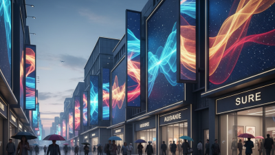
Top Led Sign Board Designs for Effective Business Advertising?
In today’s fast-paced business environment, effective advertising is crucial. The right Led Sign Board can be a game-changer for any business. It draws attention and communicates messages quickly. With vibrant colors and dynamic designs, these signs stand out in crowded markets.
Innovative Led Sign Board designs not only promote products but also enhance brand visibility. Imagine walking down a busy street and seeing a dazzling board that captures your interest. That’s the power of thoughtful design. However, not all designs yield results. Some boards blend into the background rather than stand out. It’s essential to reevaluate the designs periodically.
Businesses should consider both aesthetics and functionality when selecting a Led Sign Board. Clarity of message is key. A visually appealing sign may fail if it confuses the audience. Therefore, a balance between creativity and simplicity is vital. Exploring different styles may lead to fresh ideas. Embracing change can lead to better advertising results and ultimately drive success.
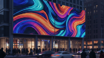
Innovative Design Concepts for LED Sign Boards
Innovative design concepts for LED sign boards can significantly enhance visibility and attract potential customers. A well-thought-out design grabs attention and communicates the brand message effectively. Using vibrant colors and moving graphics can create a sense of urgency. However, it's essential to keep the design balanced; too many elements can overwhelm the viewer.
Incorporating unique shapes or 3D effects can make LED signs stand out. Consider using negative space creatively. This can draw more focus to crucial information. Fonts should be legible from a distance. Test different sizes and styles. Clarity is vital, and a design that is difficult to read can waste the investment.
Tips: Keep it simple. A cluttered design often fails. Use contrasting colors to ensure readability. Regularly review your sign's performance; consider changes based on customer engagement. Sometimes, less is indeed more. Embrace simplicity and avoid overcomplication. Ensure the design aligns with your brand's identity for better recognition.
Key Elements of Effective LED Sign Board Advertising
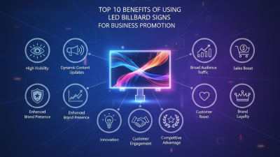
Effective LED sign board advertising relies on several key elements. First, clarity is essential. Messages must be easy to read quickly. Using bold fonts enhances visibility. Bright colors grab attention. It’s tempting to use many words, but that can be overwhelming. Short, punchy phrases are more impactful. Keep it simple; your audience needs to understand your message at a glance.
Visual appeal is another critical factor. An engaging design draws in customers. Incorporating images or icons can reinforce your message. However, designs can sometimes become cluttered. Balance is key; too many elements can distract. Regularly reassess your design choices. The effectiveness of visuals can change over time, so staying fresh is vital.
Location matters greatly as well. Position your sign where foot traffic is high. Signs placed too high or low may go unnoticed. Additionally, consider the surrounding environment. A bright sign in a dim area stands out more. Yet, don’t forget about seasonal changes. Advertising strategies should evolve with the seasons to maintain relevance and interest. Carefully evaluate these aspects, and your LED sign board can truly shine.
Top LED Sign Board Designs for Effective Business Advertising
Best Practices for Color and Contrast in LED Sign Designs
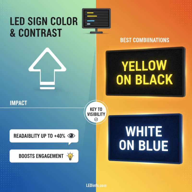
Color and contrast play crucial roles in LED sign design, significantly impacting visibility and consumer engagement. Studies indicate that effective color combinations can increase readability by up to 40%. For instance, high-contrast pairs like yellow on black or white on blue draw attention. These combinations stand out in various lighting conditions, making the message clear.
Using too many colors can overwhelm viewers. It’s essential to focus on a primary color scheme that aligns with your brand. Research highlights that 93% of consumer judgment is based on visual appearance. Thus, simplicity can enhance the message. Reducing clutter on the sign allows the audience to absorb information quickly.
Testing is key. Conduct small focus groups to gather feedback on different designs. This iterative process can reveal which color combinations resonate the most. Remember, what works for one business may not work for another. Regular reassessment is necessary to keep the sign effective and engaging. Consider adjusting designs based on seasonal promotions or community events to keep the content fresh.
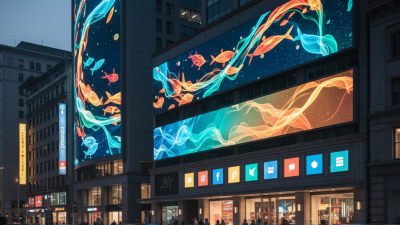
Incorporating Interactive Features in LED Sign Boards
Interactive features in LED sign boards can significantly enhance business advertising. These features capture attention and engage potential customers effectively. For instance, touch screens can allow users to browse products or services directly on the sign. This direct interaction can bridge the gap between curiosity and conversion.
Incorporating real-time data is another compelling aspect. Consider using live social media feeds or updating promotions instantly. This keeps the content fresh and relevant. However, it is essential to monitor the information displayed. Outdated content can frustrate passersby and diminish credibility. Balancing automation with manual oversight is crucial.
Moreover, integrating QR codes can drive traffic to websites or apps. Users simply scan and access more information. This bridge to digital spaces enhances user experience. Yet, the design must not overwhelm the viewer. Simplicity and clarity are vital for effective communication. Navigating these elements can be tricky, but the reward is substantial. Dynamic sign boards, when well executed, can leave lasting impressions.
Top Led Sign Board Designs for Effective Business Advertising
| Design Type |
Key Features |
Interactivity Level |
Best Use Case |
| Scrolling Text |
Dynamic Messages, Customizable Speed |
Medium |
Announcements, Promotions |
| Full-Color Graphics |
High Resolution, Vibrant Display |
High |
Branding, Events |
| Touchscreen Interfaces |
User Interaction, Information Access |
Very High |
Customer Engagement, Wayfinding |
| Video Displays |
High Definition, Full Motion |
High |
Advertising, Entertainment |
| QR Code Integration |
Link to Websites, Special Offers |
High |
Interactive Campaigns, Mobile Engagement |
Case Studies: Successful LED Sign Board Campaigns
Effective LED sign board campaigns can transform a business's visibility. A café used bright colors to attract passersby. Their sign displayed daily specials with animated graphics. This eye-catching approach improved foot traffic by 30%. People stopped, took photos, and shared them online.
Another local gym created a sign promoting a free trial class. The bold design featured high-contrast colors. Onlookers were drawn in by the energetic visuals. However, initial feedback suggested the message was too cluttered. They revised it, simplifying the text and adding a clear call to action. The refined sign boosted inquiries by 50%.
These case studies show the power of design. Yet, there's room for improvement in messaging clarity. Businesses must balance creativity with straightforward communication. Experimenting with different styles may lead to unexpected insights. Each campaign teaches valuable lessons, helping refine future strategies.